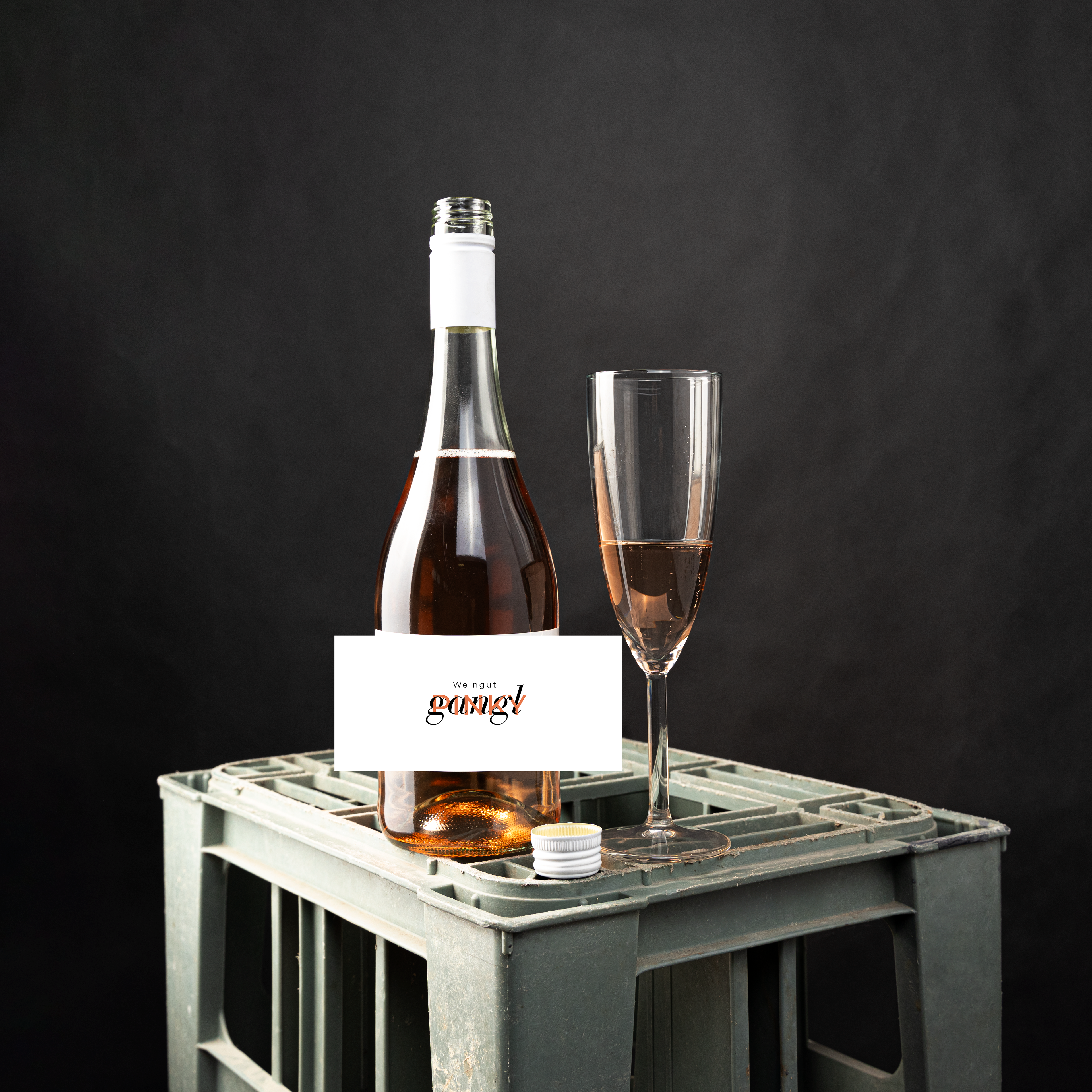
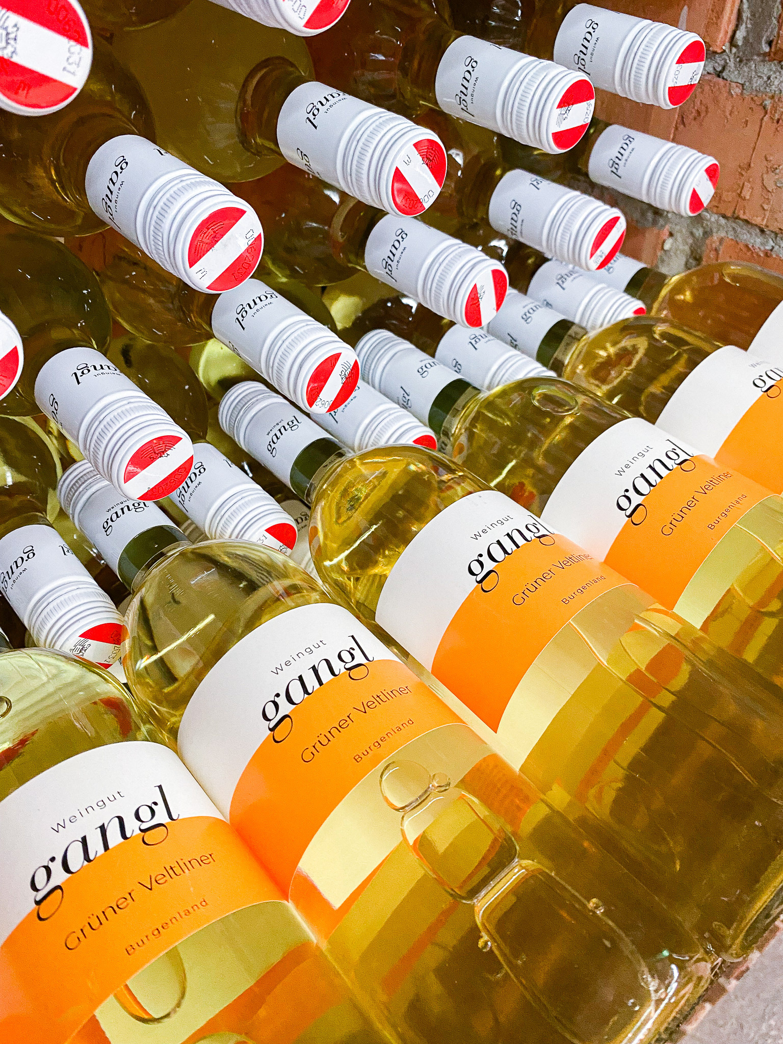
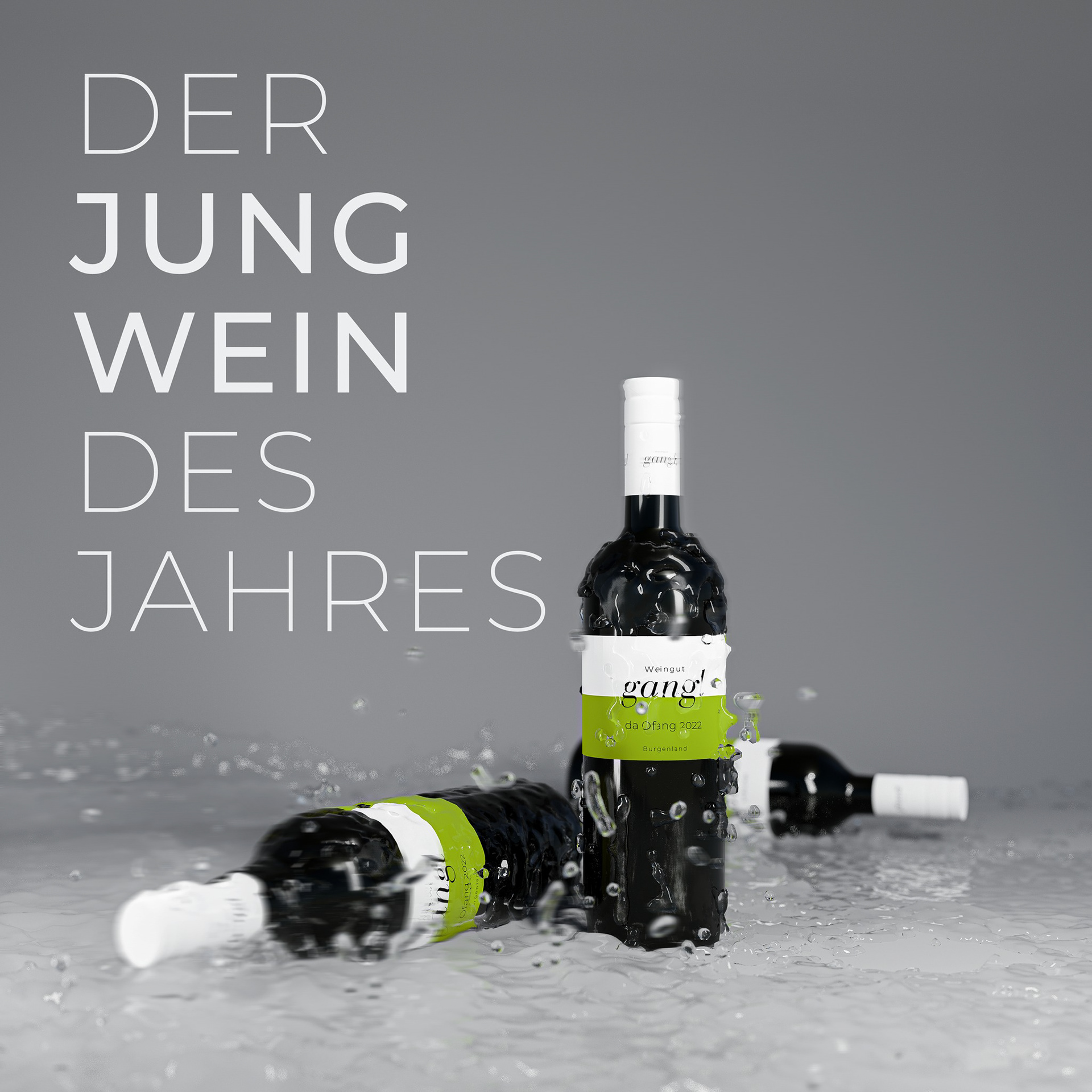
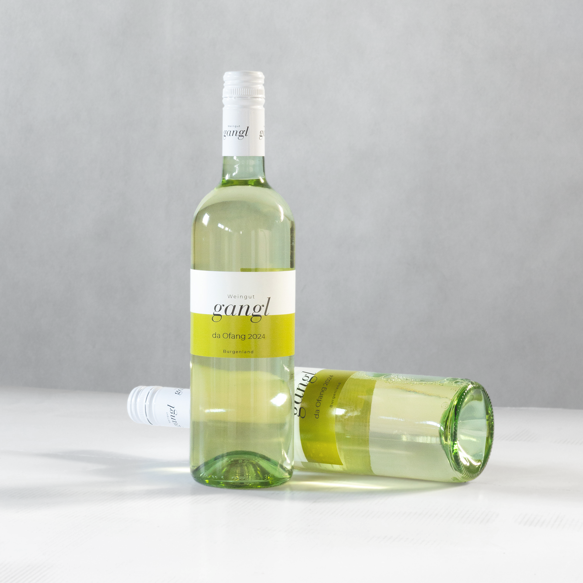
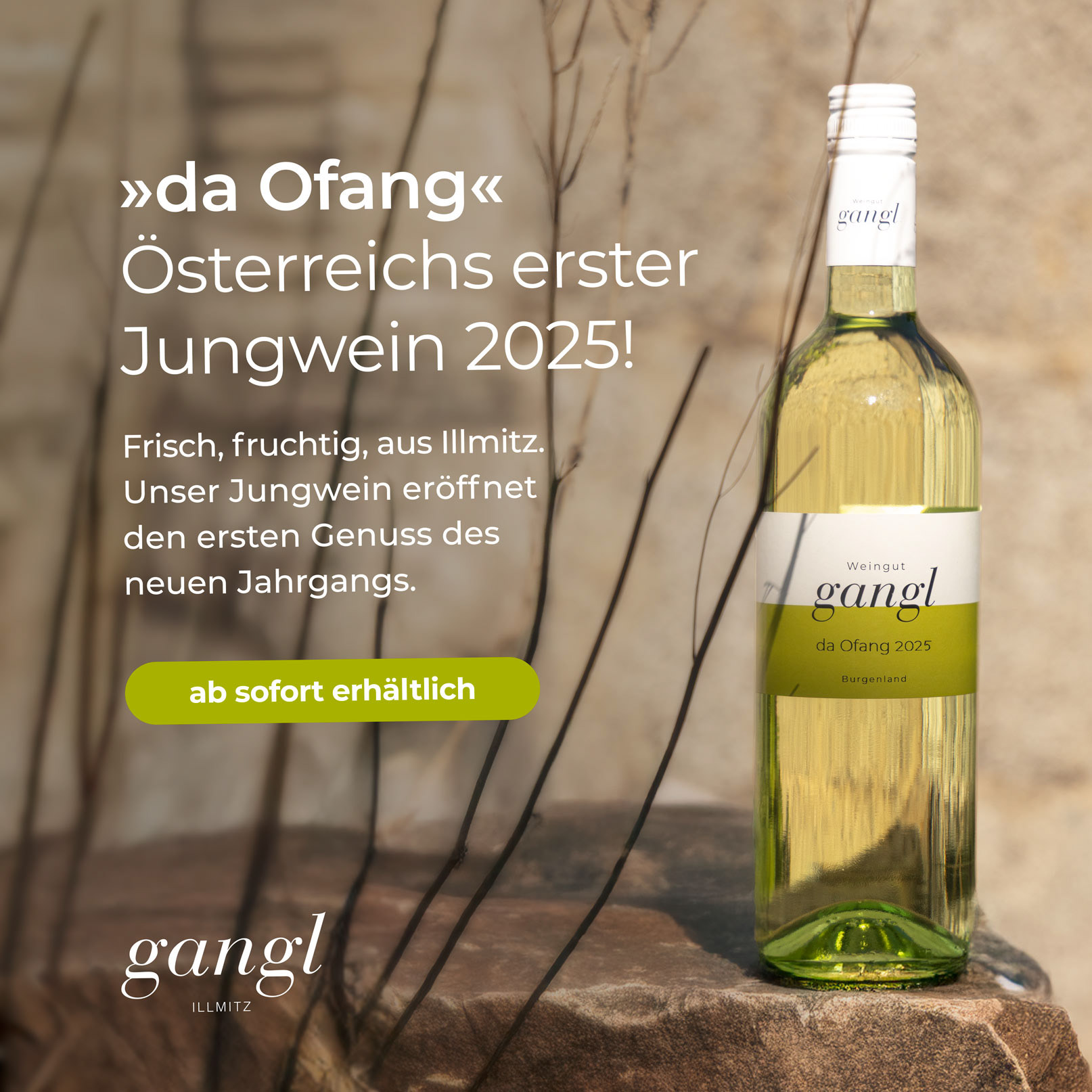
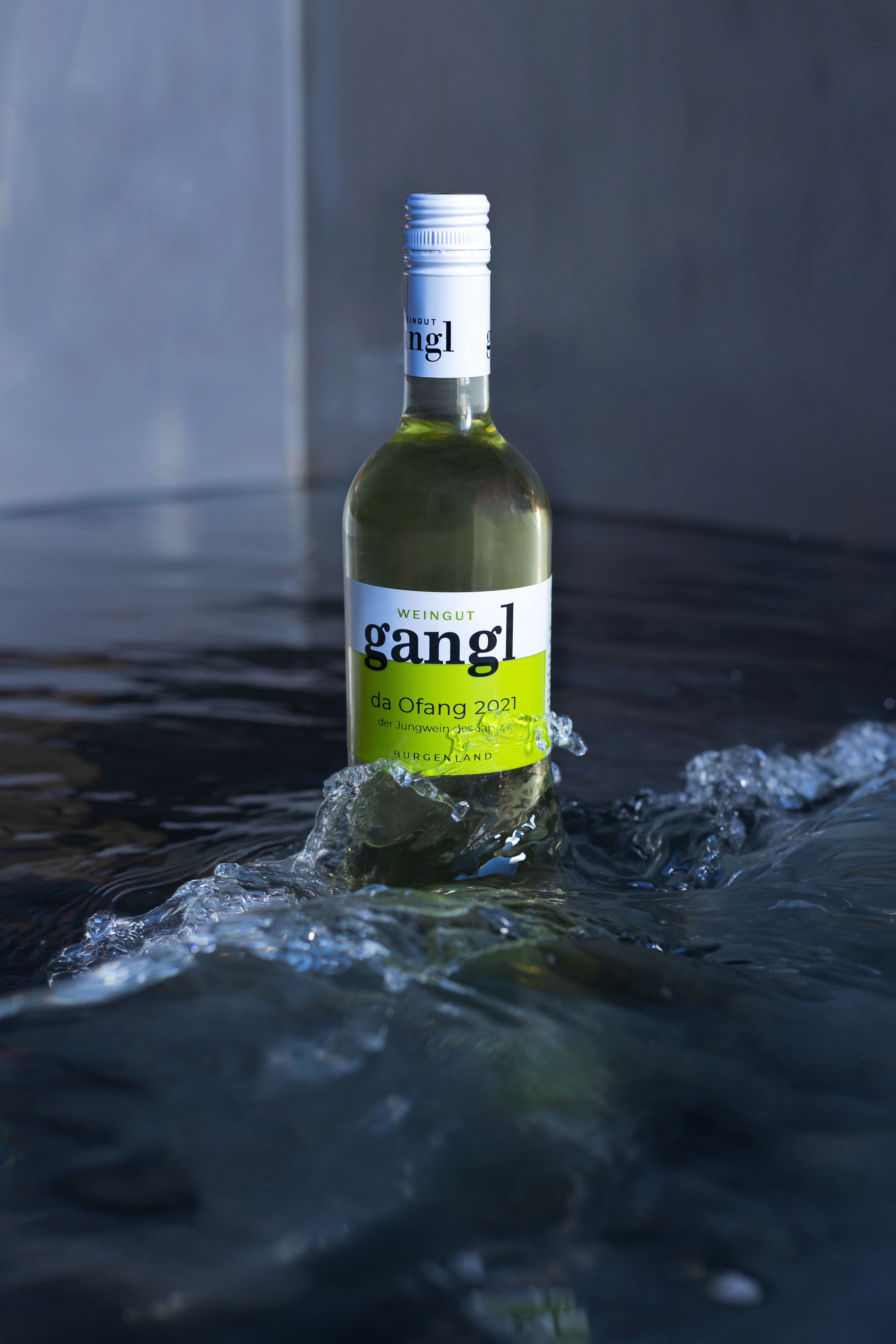
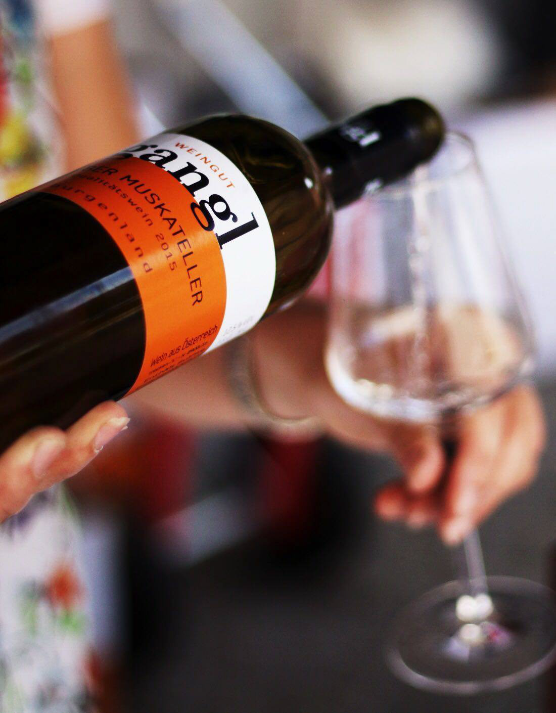
»Gangl« is a family-run winery that specializes in the production of various types of wines, including white, red, rosé, sweet, and sparkling wines. One of the key factors for the business is the creation of balanced wines, both in taste and in nature. Over the years, the branding of »Gangl« has gone through different stages, but the use of the distinctive orange color has remained constant, making the brand easily recognizable to customers.


previous appearance
The final branding concept contains two main components: the logo and the half division. The logo features the brand name in a classic font, using an italic weight to create a unique and dynamic look. The half division represents balance in every aspect of the brand, including the taste of the wine, the production process, and the harmony and balance inbetween the family. This symbol is intended to be present in a wide range of products and will help to increase the brand's recognition.
The half division symbolizes the balance in the taste of the wine, the production process, and the relationship between the family members. It helps to reinforce the brand's commitment to producing high-quality, well-balanced wines. The orange color is an important aspect of the branding, helping to differentiate the »Gangl« brand from competitors and making it easily recognizable to customers. The use of a classic font for the logo adds a touch of elegance and sophistication to the brand, while the italic weight creates a sense of motion and dynamic energy.


Additionally, the winery has introduced two new colors to its branding, red and green, to represent the red and white wines respectively. The red color is used for their red wine offerings, adding a bold and rich tone to the brand. Meanwhile, the green color is used specifically for their first wine of the year, the »da ofang«. The green color represents the fresh and youthful characteristics of the wine, adding a unique touch to the overall branding of the winery. By using a combination of colors and symbols, the winery has created a strong and recognizable brand identity that truly reflects the quality and values of their products.
Overall, the »Gangl« branding project is designed to create a strong, recognizable brand image that reflects the values and qualities of the winery and its products. The combination of the logo, half division, orange color, and classic font creates a cohesive and memorable brand identity that will help »Gangl« stand out in a crowded market.


Annual Campaign: da Ofang
A distinctive highlight within the brand communication is the yearly launch of the Jungwein »da Ofang«. As the very first wine of the season in Austria, it carries both symbolic and emotional weight: it marks the beginning of a new vintage and celebrates the freshness and vitality of the year’s harvest.
The campaign concept translates these values into a visual and verbal identity that is consistent yet adaptable each year. Green has been established as the dedicated campaign color representing freshness, youth, and renewal and is used across packaging, print, and digital media. The design direction remains bold yet minimal, aligning with the overall branding while emphasizing the unique character of the Jungwein.
Through clear typography, seasonal visuals, and focused messaging, the campaign creates a recognizable ritual: every year, »da Ofang« is not only released as a product but also positioned as an event that resonates both locally and beyond.


