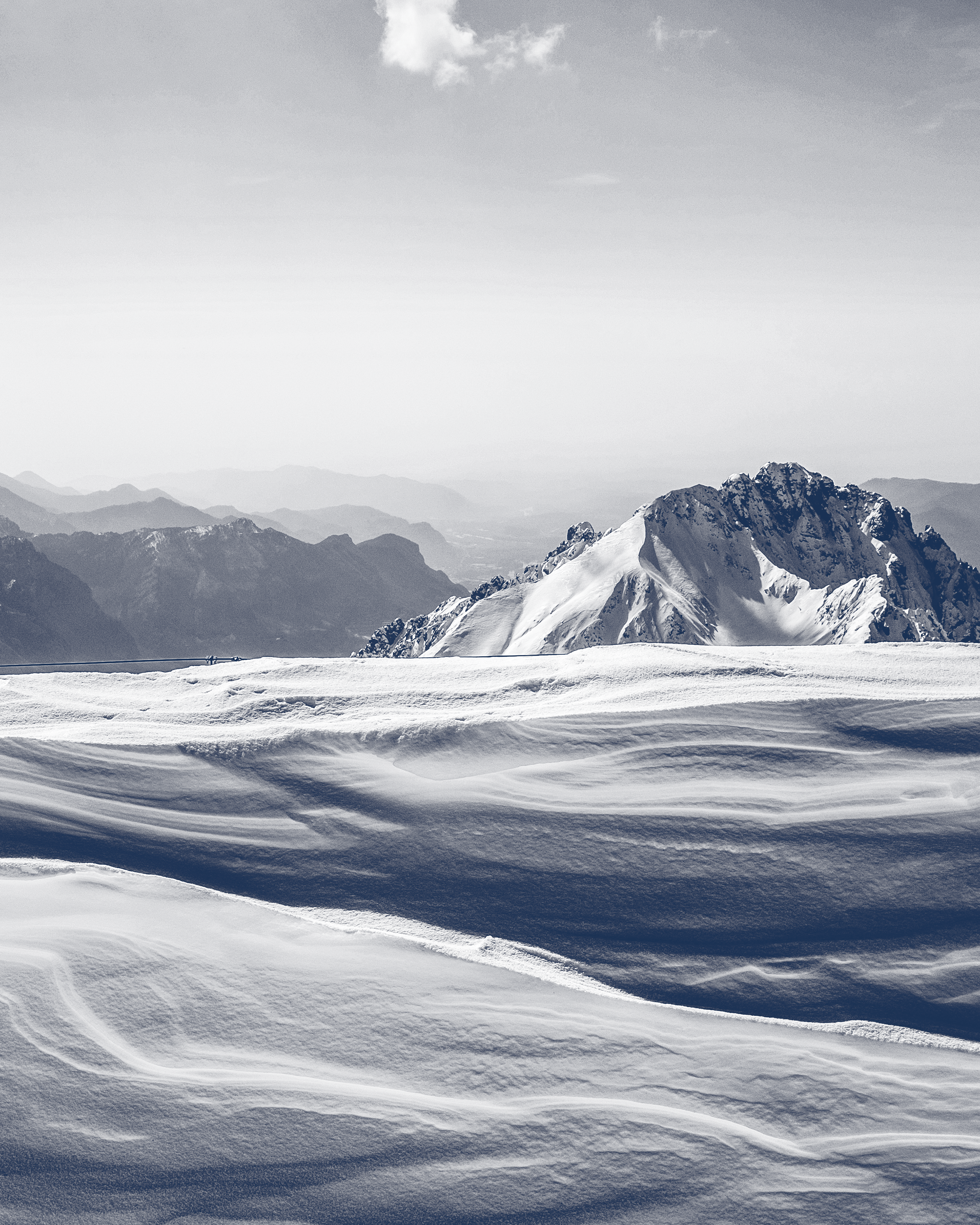
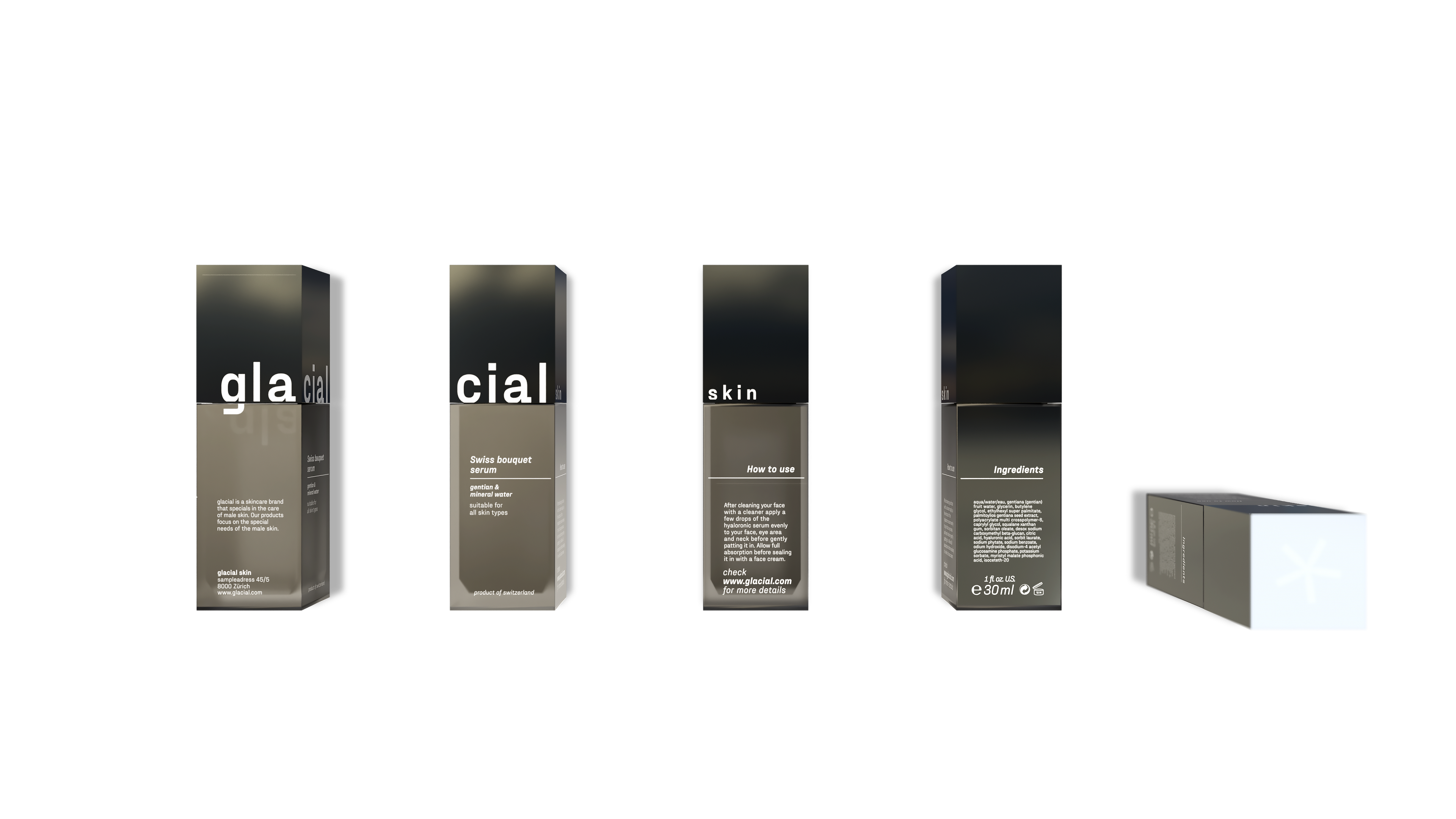
The brand »glacial« is committed to providing high-quality skincare products for men. However, women can also benefit from using these products. The brand's products are inspired by the Swiss Alps and are formulated to combat dry and pale skin and early signs of aging.
The brand places a strong emphasis on using clean and natural ingredients. Two of the brand's key ingredients are Swiss gentian and mineral water sourced from the Swiss Alps. These ingredients are found in all of the brand's products, including the two best-selling serums: hyaluronic acid and Swiss bouquet.
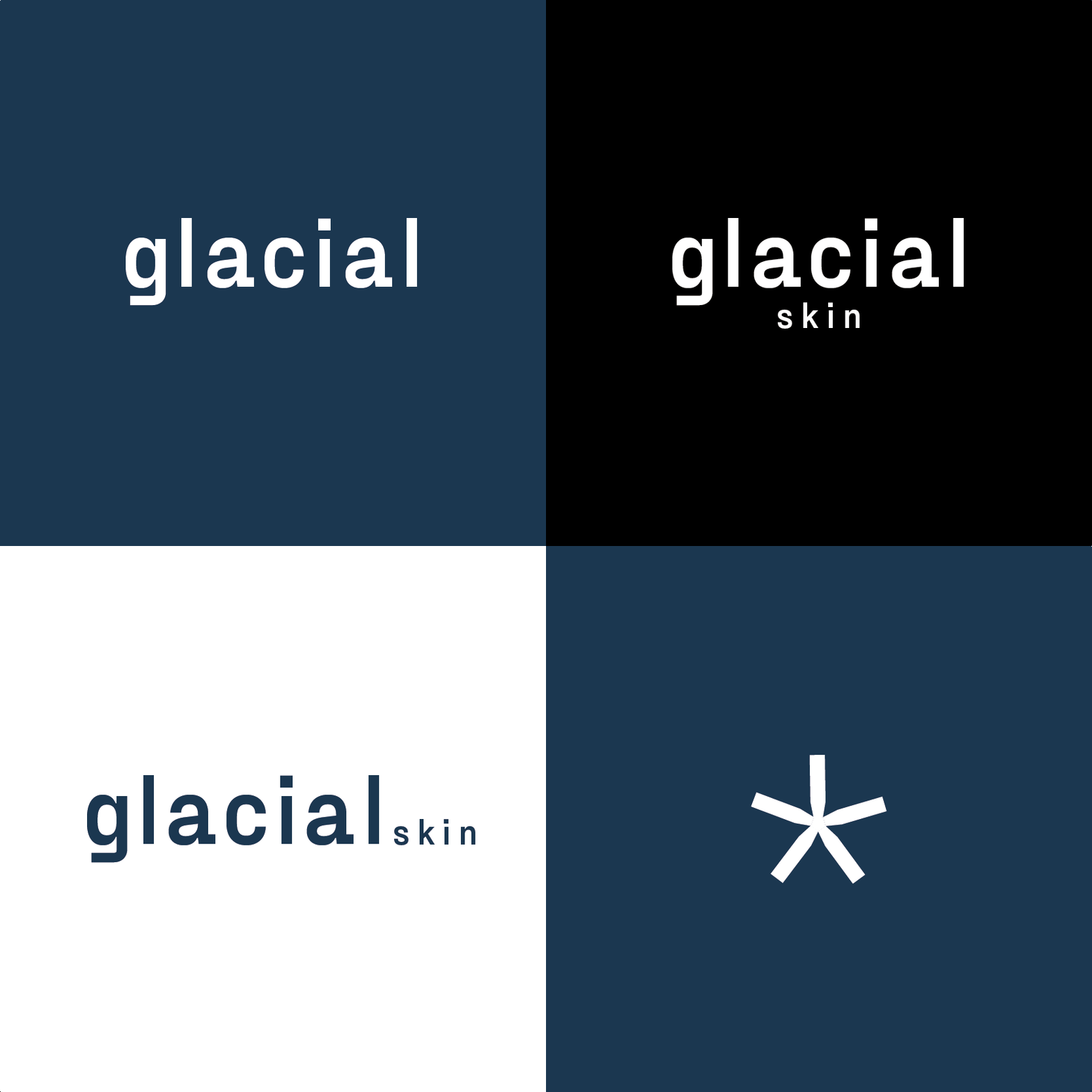
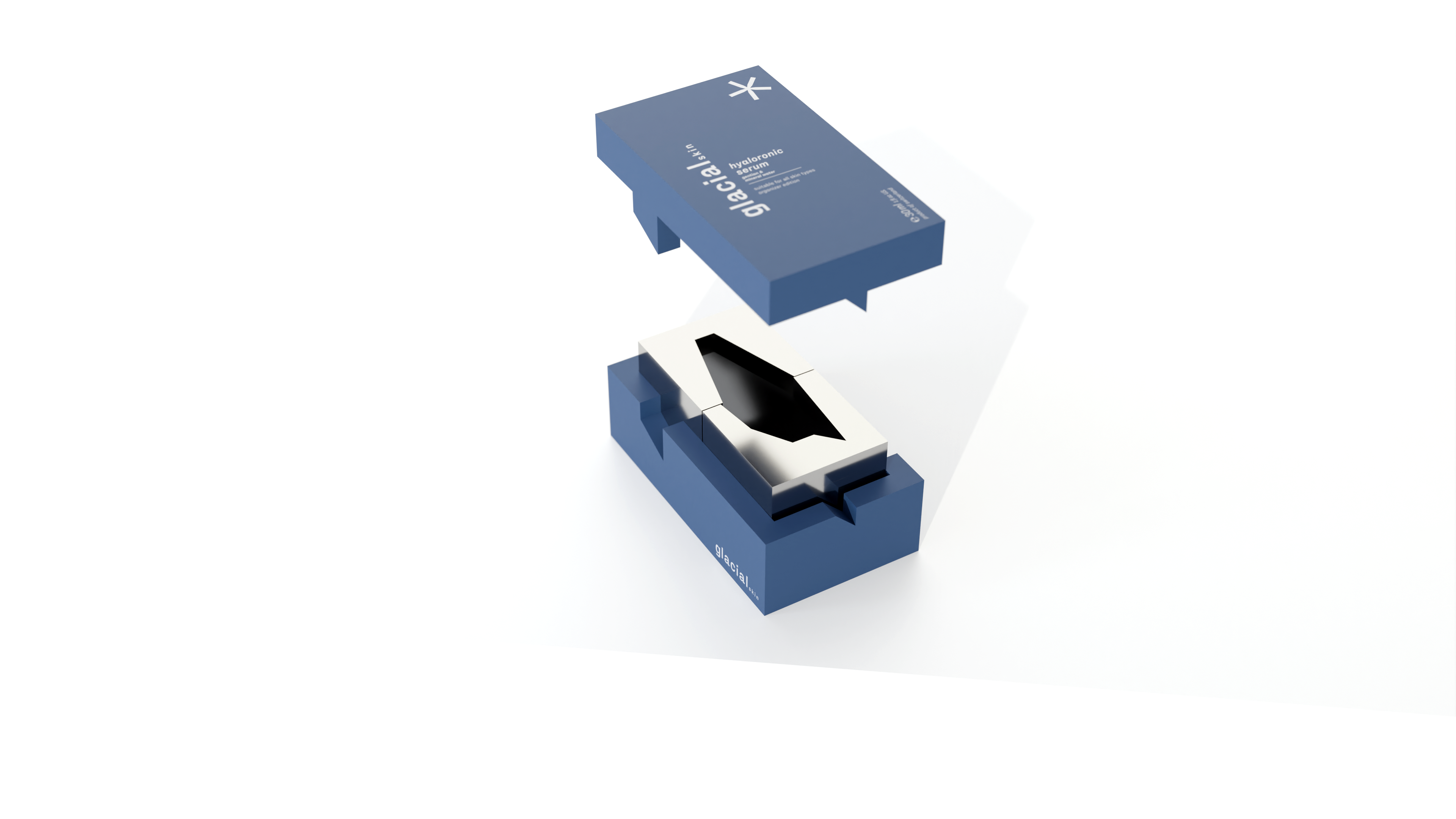
The project's goals were to create a brand and design its packaging. The branding features a unique and edgy design, inspired by the Swiss Alps, which represents the brand's identity. The brand's name, »glacial«, is a combination of the words »glacier« and »facial«, and the sans-serif font used in the branding has edgy details. The brand's logo features a star, which symbolizes a snowflake and a gentian flower, and is used to balance the design. The brand's representative color is a blue tone, with certain areas accented in chrome or silver.
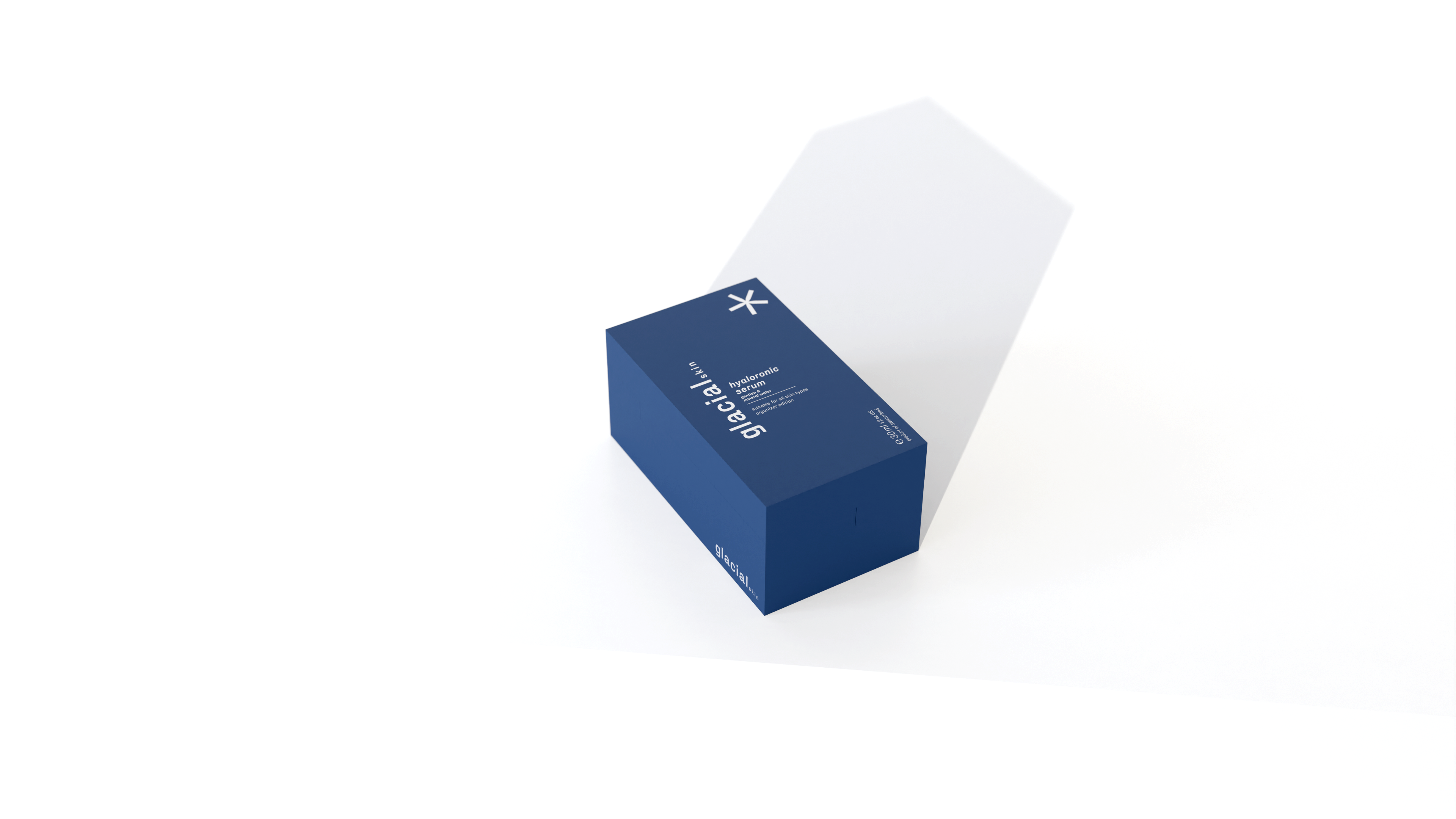
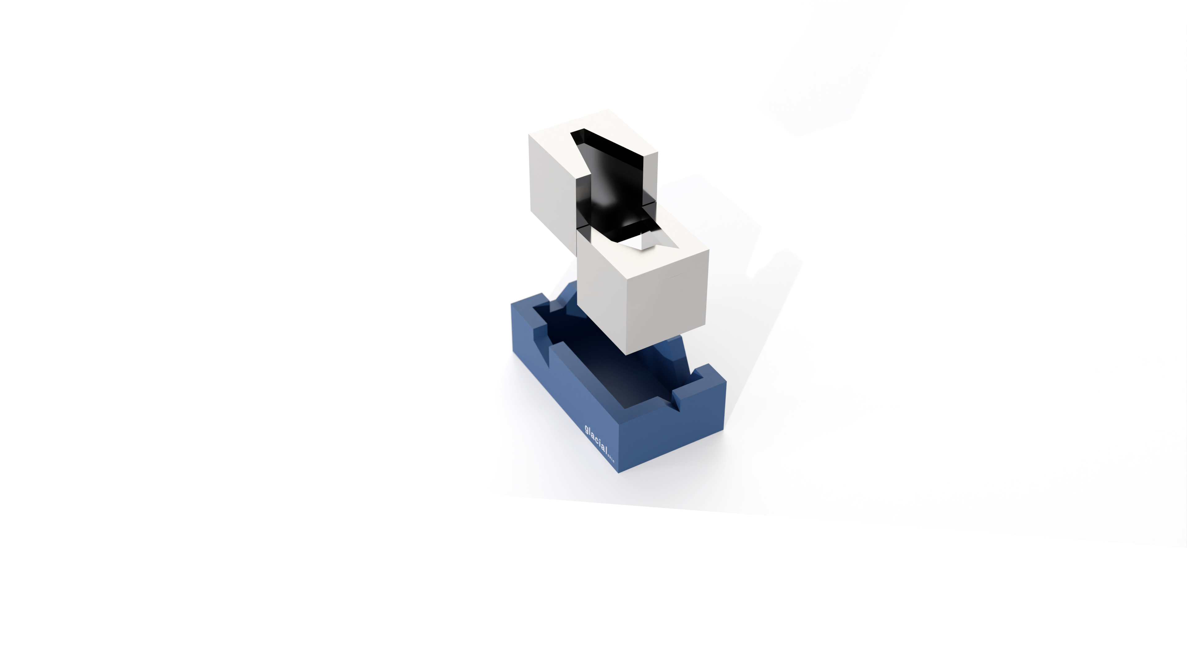
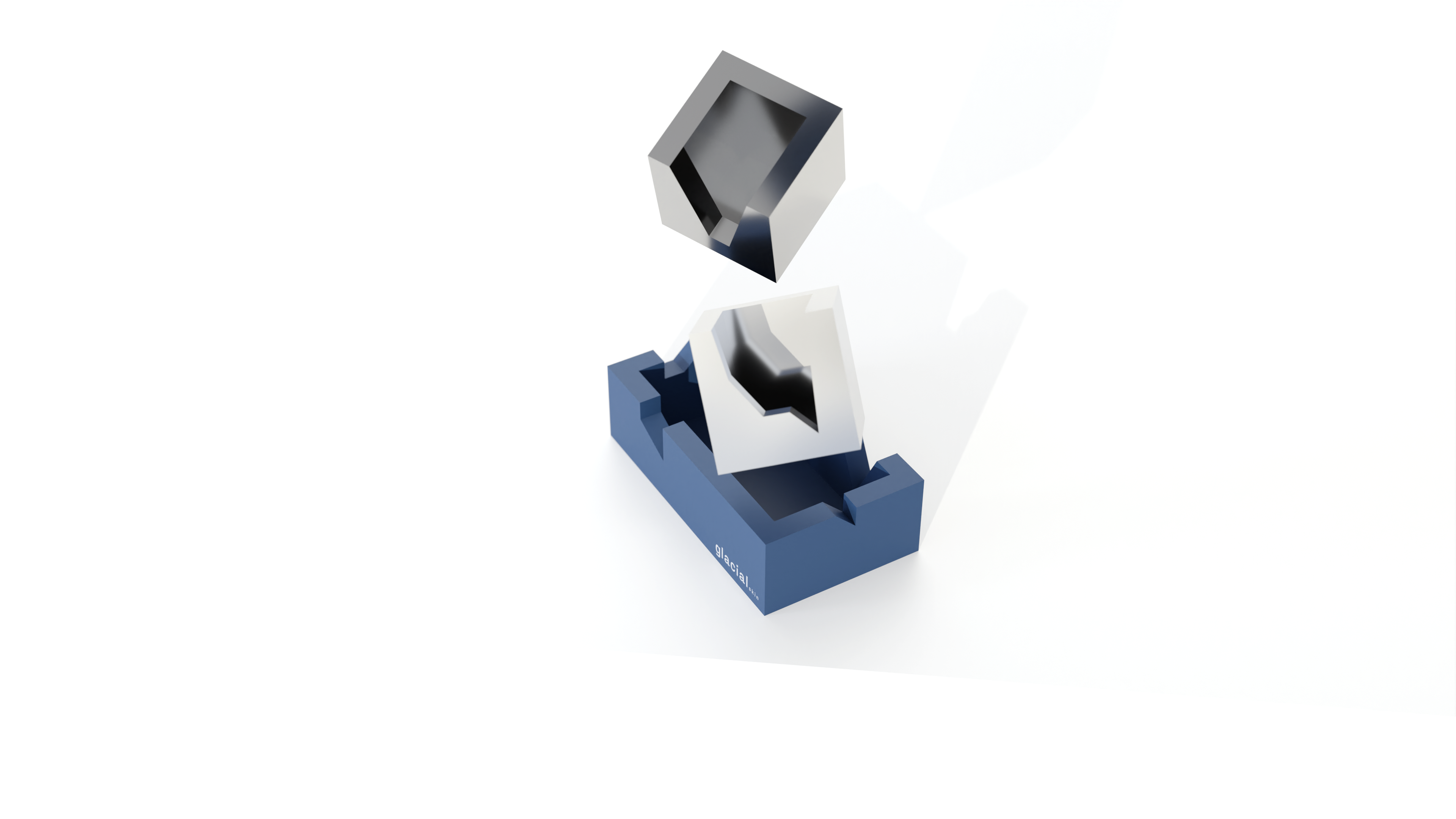
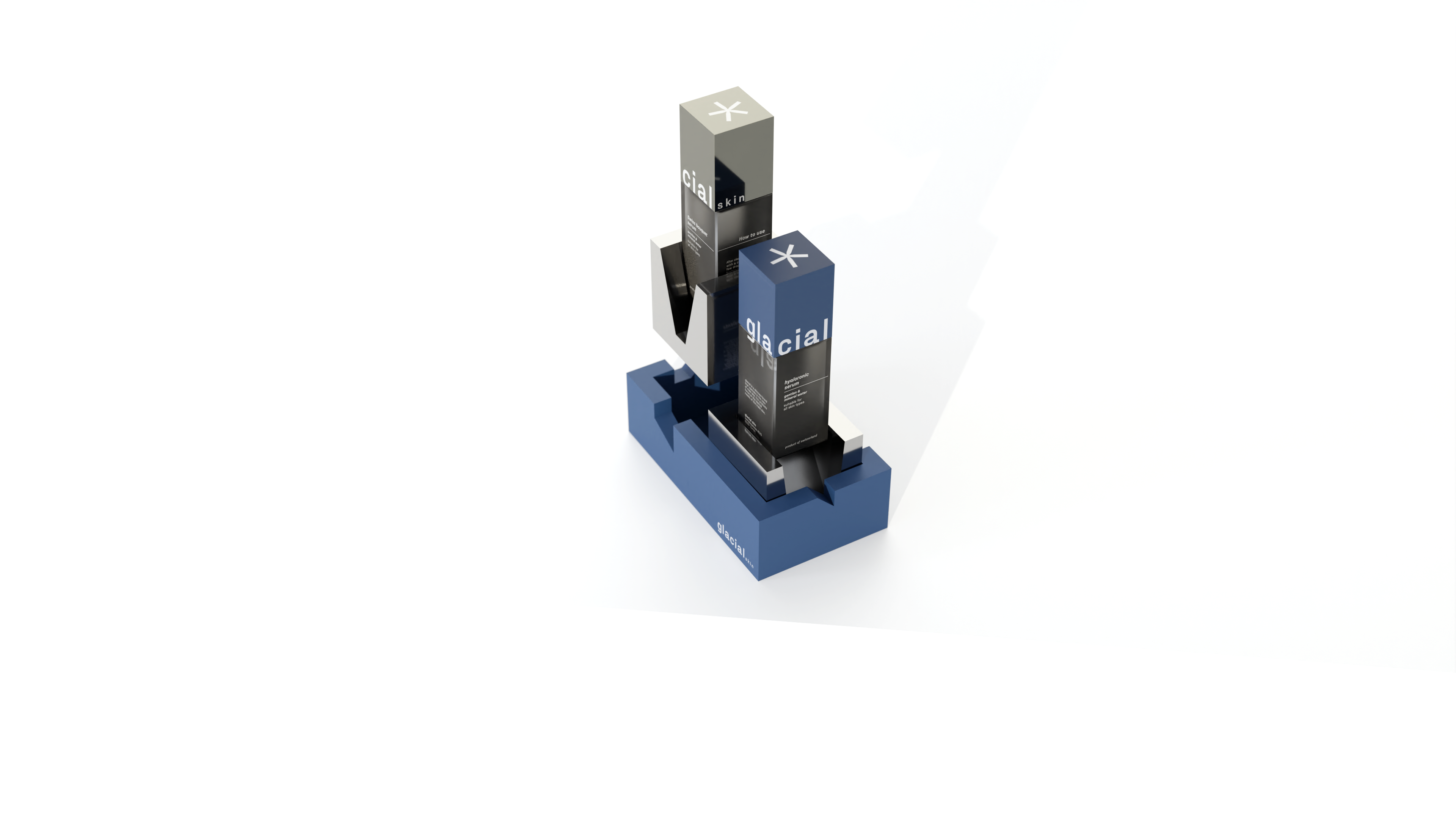
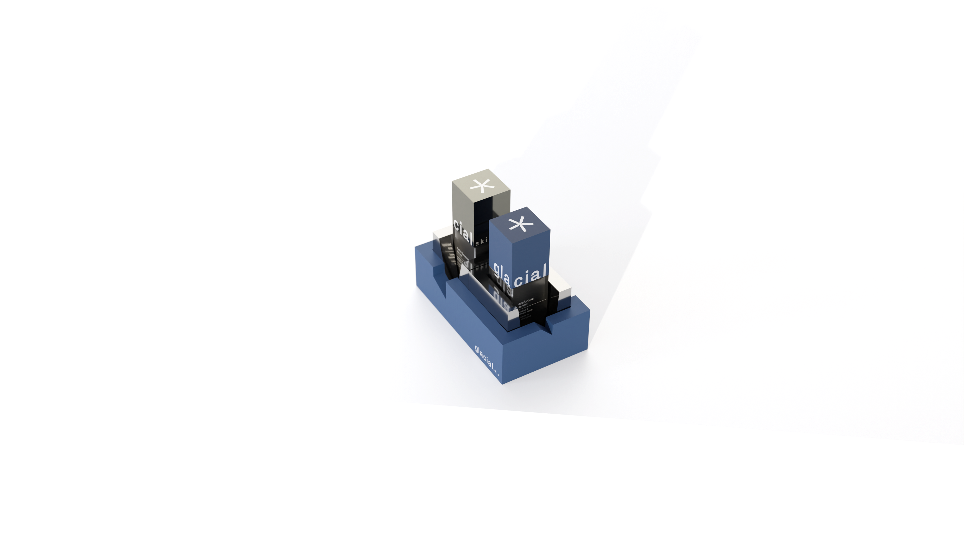
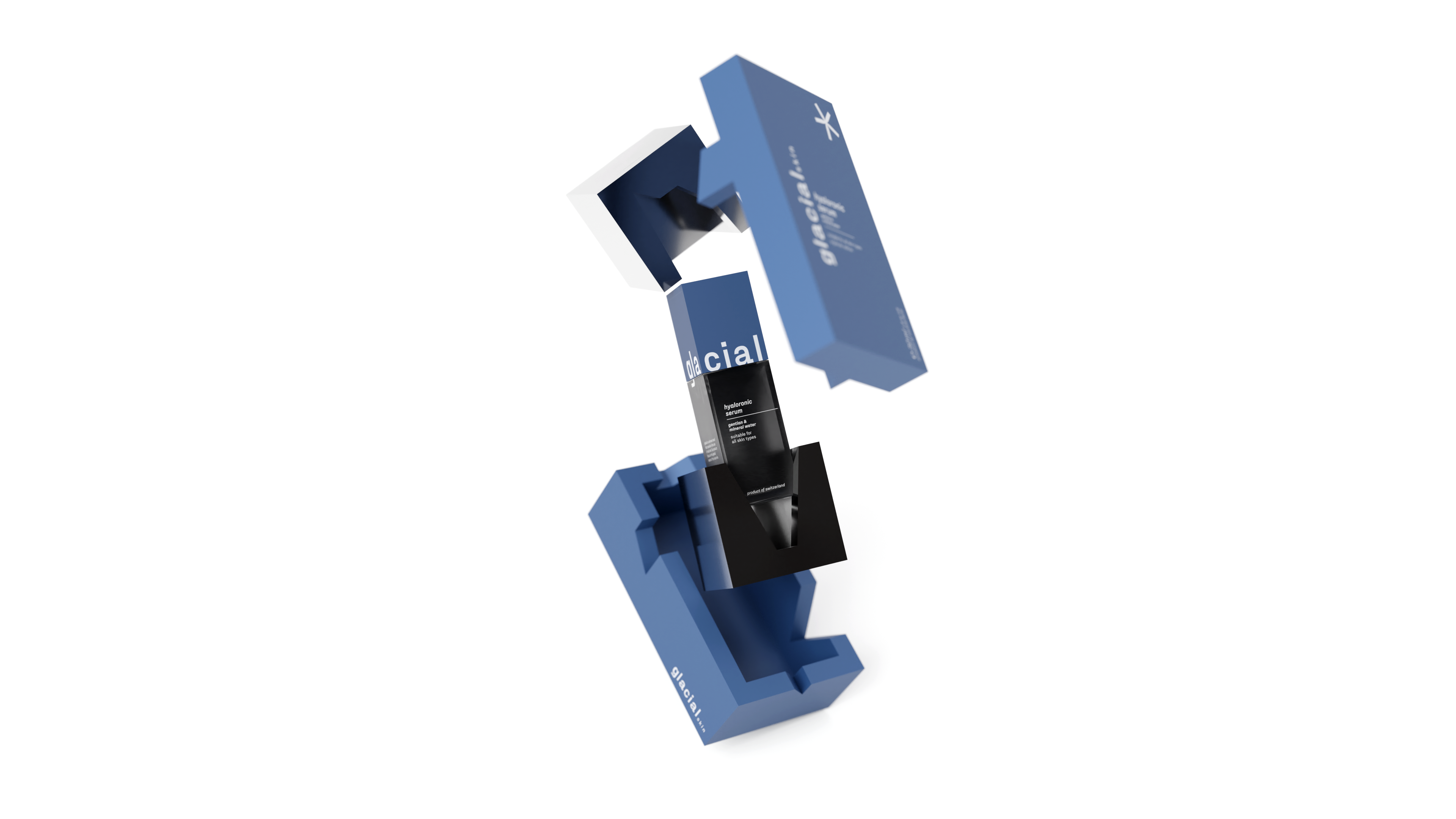
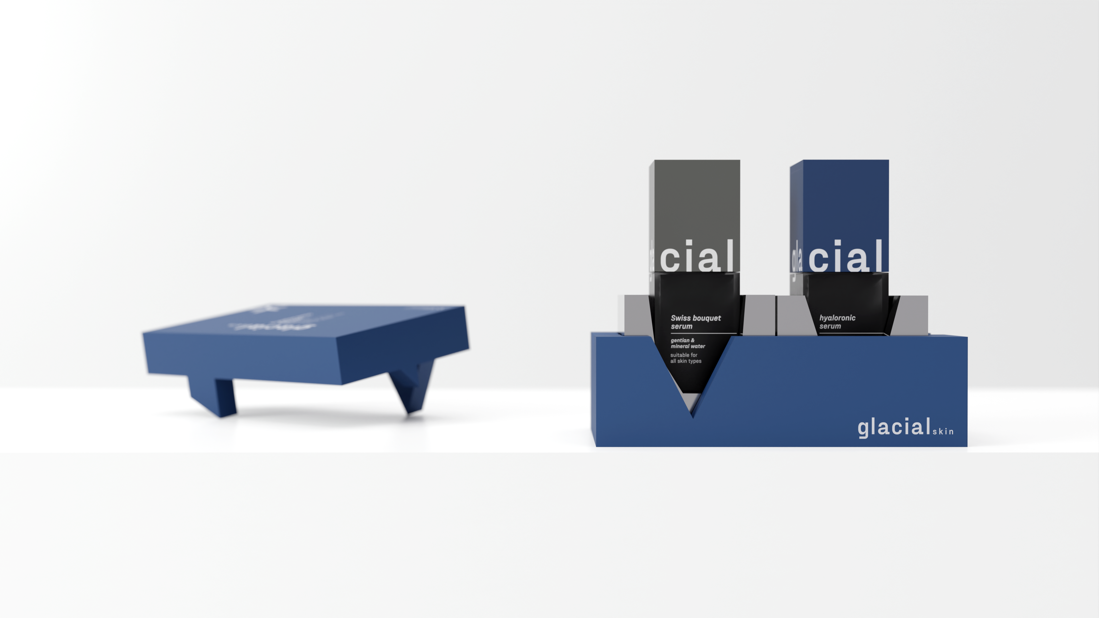
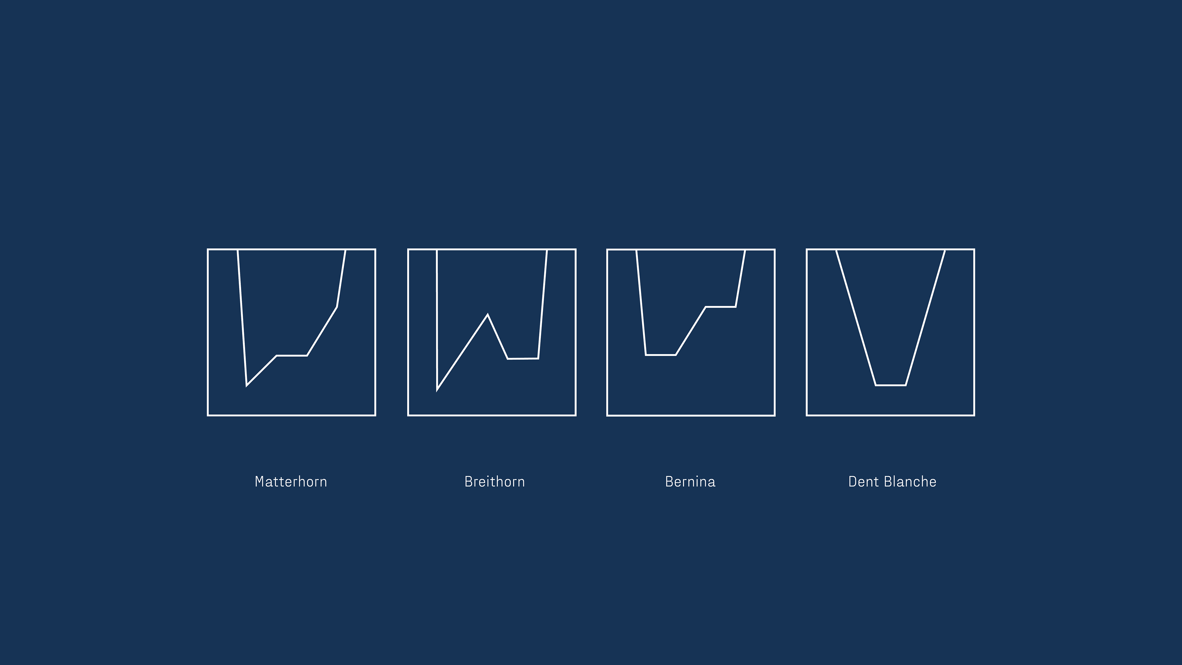
The packaging comes in two forms: an organized edition and a classic refill set. The organized edition is a large box that can be used to store the serums in an organized manner in the bathroom. The box is made of four parts of cardboard, with two silver parts that hold the serum in place. The silver parts feature cutouts that represent different mountains in Switzerland. The classic refill set is a smaller, standalone package for customers who don't need to purchase the larger box.
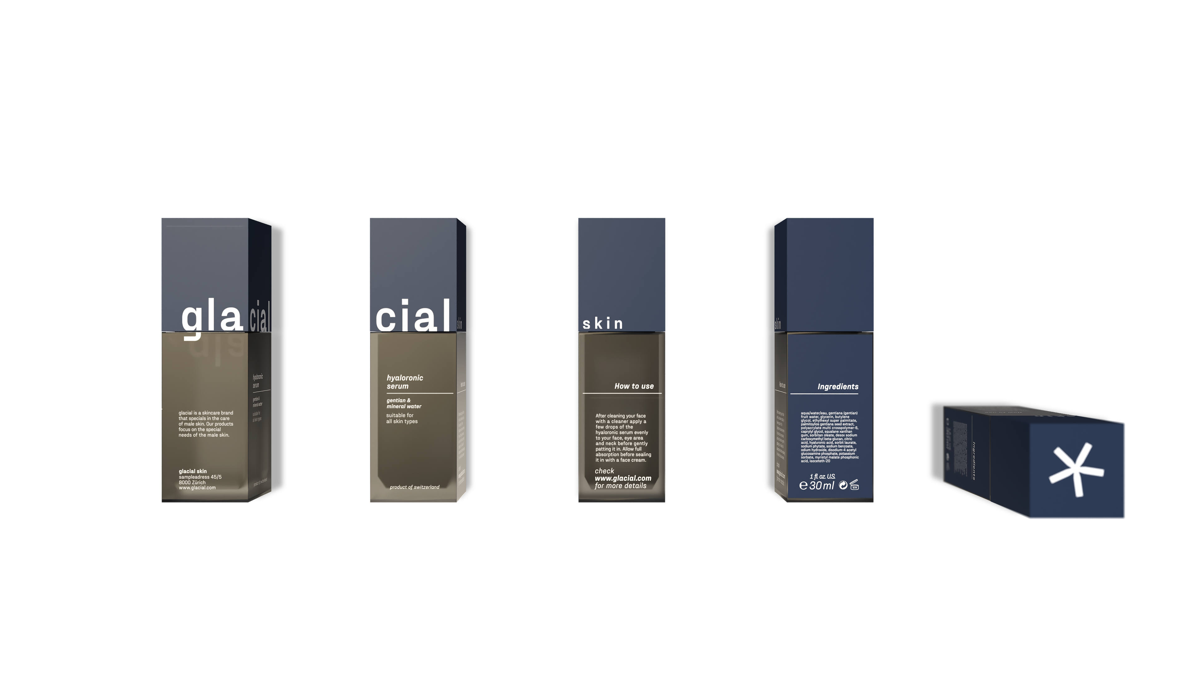
The design of the serum flasks was also an important aspect of the project. The edgy bottle design highlights the overall concept of the brand. The information and text printed on the bottle were also designed to fit seamlessly into the overall arrangement.
Overall, great attention was paid to the design language of the brand, resulting in a coherent and well-designed project that could be launched without any missing details.