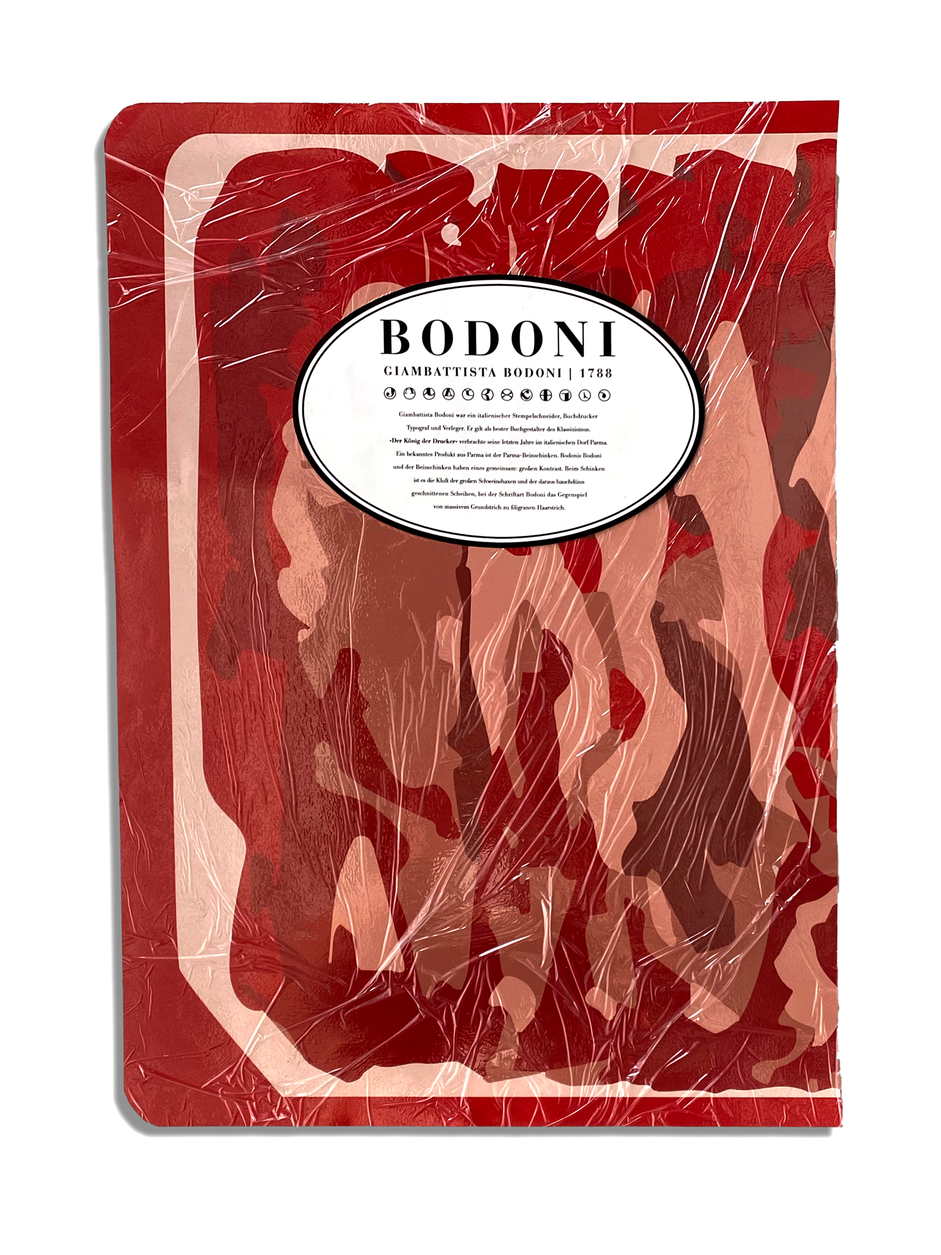
Poster and Flyer dealing about the beloved font (Bauer) Bodoni by Giambattista Bodoni and Heinrich Jost. The Keyvisual which is used in both, the Poster and Flyer, is based on a slightly different point of view as expected in the first place when thinking about Bodoni.
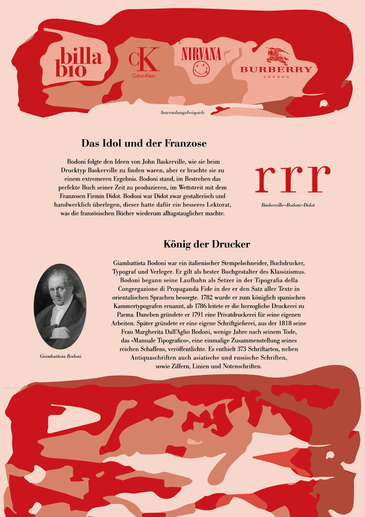
Inside the Folder several information of the typedesigner, the font in detail, some logos Bodoni is used in, as well as some information of the font itself is displayed.
When it comes to the meaning of the visual, you need to know that the so called »King of Printers« spent his last years in the italian village Parma. A well-known product from Parma is the parma ham. Furthermore they share great contrast as well. The ham shows contrast between its large pork knuckle and the wafer-thin cut slices, compared to the font thats well known for its extreme contrast between thick and thin strokes.
Finishing touch ups were made with a sealed, transparent packaging for the folder and a layer of cleanfilm on the poster.
Poster, printed in A2
Flyer, printed in A4, folded into 105x210 mm / 4,1x8,3 inch